Composition
have you ever heard about composition in photography? Weird concept, isnt it? After all, as a travel photographer we usually do not change what we find in the outside world (although some photographers do that).
Still, by simply changing the angle of a picture we may get completely different results.
When looking at the photos of famous subjects (lets Ayers Rock in Australia) you will find that many pictures were taken from exactly the same position, but look quite differently.
For example, when taking a picture of the ocean, we very often instinctively position the horizon in the centre.
How about trying out different approaches? Concentrating on the water and only showing a tiny bit of sky? Or the other way round, if you have an interesting sky?
Why not move that boat from the centre to the left?
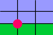
Actually, the visual arts have known a rule of thirds (or golden cut) before photography was even invented. This means that you draw imaginary lines through your picture, separating it into 3 rows and 3 columns.
You would place your horizon on one of the lines and your main object, for example, the small boat, on the intersections.
Have a look at some pictures you especially like and see whether they comply with this rule. Try it out. Then break it. But do so consciously, for a reason.
Speaking of horizons: Looking through the camera you may not notice that slight slant. But when you look at your printed picture (or even worse: the gigantic projected slide) it seems that your water is running out. Its a good idea to pay very much attention to the horizon and whenever possible use a tripod.
Examples:


more on the Geometry of a Picture